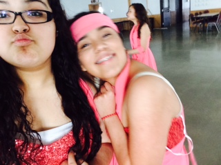
Like in my last post I had chosen in between two pictures, but I decided to do the picture of me and a friend. I hope that in the prints you'll be able to see the facial expressions and the element of the mood. A risk I'll be taking on this the extra negative space in the back and the person in the back.
For this Brainstorming post, I decided to chose between these two pictures. Both of these pictures inspire me because they look happy, fresh, and bouncy-ful. I didn't want to do something a little more "dark". I think these pictures also, convey me because I'm family oriented and I love being around people who are crazy. I am however a little worried about the space in the back and the bit of blurriness in the first with me in it. My goal is to make the mood my final point.
The first picture was taken the day before I actually finished. In my original drawing it was supposed to be purple on the outside, but with odd orange stripes. After doing that I didn't like it so I painted it all orange inside and wanted blue spots of paint everywhere. This the final look of my "duck heart". Because I'm picky, I like what happened in the inside but I would change the bright purple around it to something more subtle. Either way, I'm satisfied and my "duck heart" I believe shows emphasis in its shape.
This the shape I ended up going with. The "duck heart". Here I'm gestoing the first layer and waiting for it to dry that way I can apply the second layer. To be honest I don't like the way it ended looking. In paper when I first drawled it, the shape was slightly different, but different enough where it doesn't look like a "duck heart".
For the Elizabeth Murray project, I came up with 30 shapes. I tried to keep them different from each other because I wanted more of a variety when choosing which 3 were my favorite. Then Mrs. Singleton told me it would be okay to have them be more similar so
towards the end they started looking similar the top. I ended up choosing number 14 and number 22. This is my drawing for the Post-It poster. The elements were emphasis and form. I tried to challenge myself without being completely lost. I don't where the weird sticks at the side got there, but maybe in my mind they would give a different emphasis on the shape in the middle. The "curvy" shape in the middle happened because that's what came to my mind to give emphasis on a shape. To give extra emphasis I colored it red.
Elizabeth Murray created "Southern California" in 1976. The mood of the artwork feels like there's tensions and unity at the same time. This picture shows unity as a major element. Although, the white dot at the right-hand corner all by itself really throws me off. I'm curious though, of what made her name it "Southern California". If I could think of picture that represented So.Cal, it would be this one. Nevertheless, its interesting to me because of its shape and the odd colors.
|
AuthorWrite something about yourself. No need to be fancy, just an overview. Archives
May 2015
Categories |